Responsive web design used to be a headline. Now everyone assumes it’s handled. But most responsive design only stacks columns and shrinks layouts. It does not protect clarity, conversion or product value when context changes.
We design for the devices and scenarios that actually matter. A product demo on a wide monitor. A repeat order placed one-handed on a phone. A buyer comparing specs on a tablet. Layout is only one piece. Content adapts. Context adapts. Interaction adapts. Intent adapts.
We engineer responsive experiences across websites, SaaS products and ecommerce journeys. Structured content, motion and navigation tuned to each breakpoint so nothing gets lost on the way to the goal.
Responsive matters more than ever. It just needs to mean something again.
Designed performance that adapts to behaviour
Responsive web design is not only about fitting the screen. It is about keeping momentum. We design layouts, motion and navigation that adapt to how people actually browse. Faster perceived load on mobile. Clearer signposting when attention is short. Interactions that reduce effort, not add to it.
Performance has to be designed early. That is why we run content priority workshops across breakpoints. We focus on the intent behind every interaction on every device. Someone researching on their phone and completing the purchase on desktop. Someone comparing options on a tablet in a meeting. Someone finding a key feature in seconds rather than scrolling for it.
When the design respects behaviour, users keep moving forward. Performance becomes baked in, not bolted on.
Content and interactions that respond to context
Most responsive work reshuffles elements. Content gets oversized on desktop and starved on mobile. Meaning is lost as screens shrink.
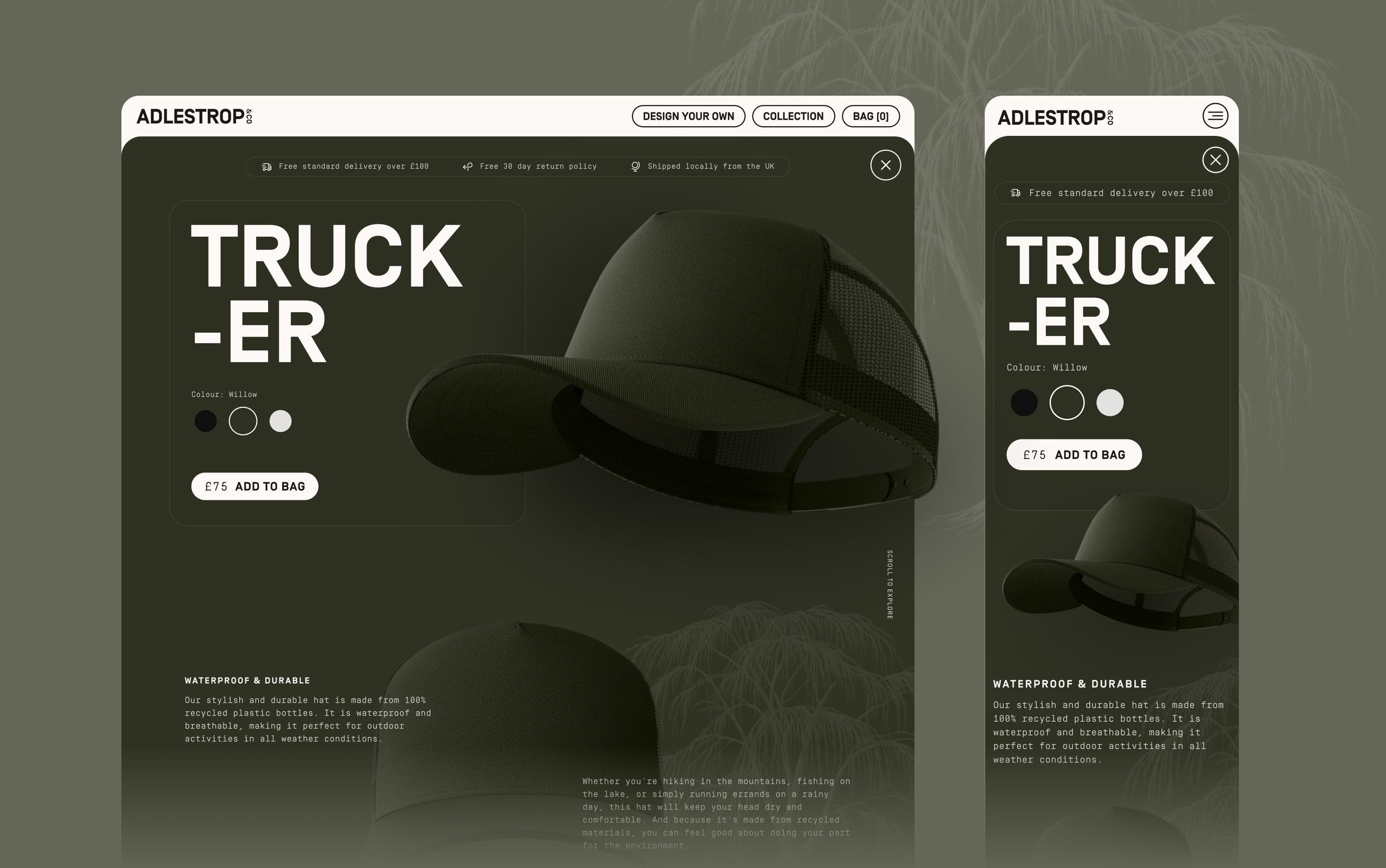
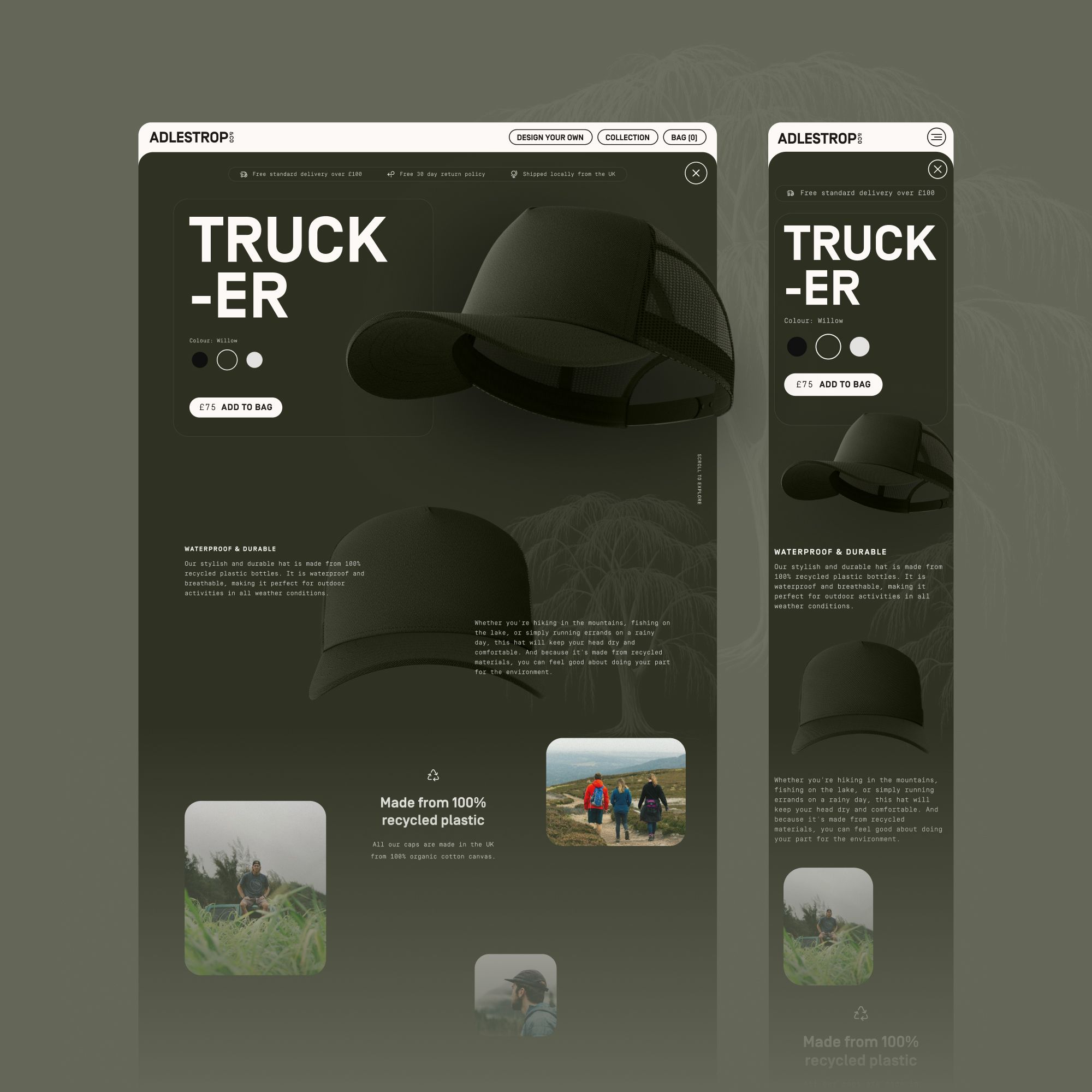
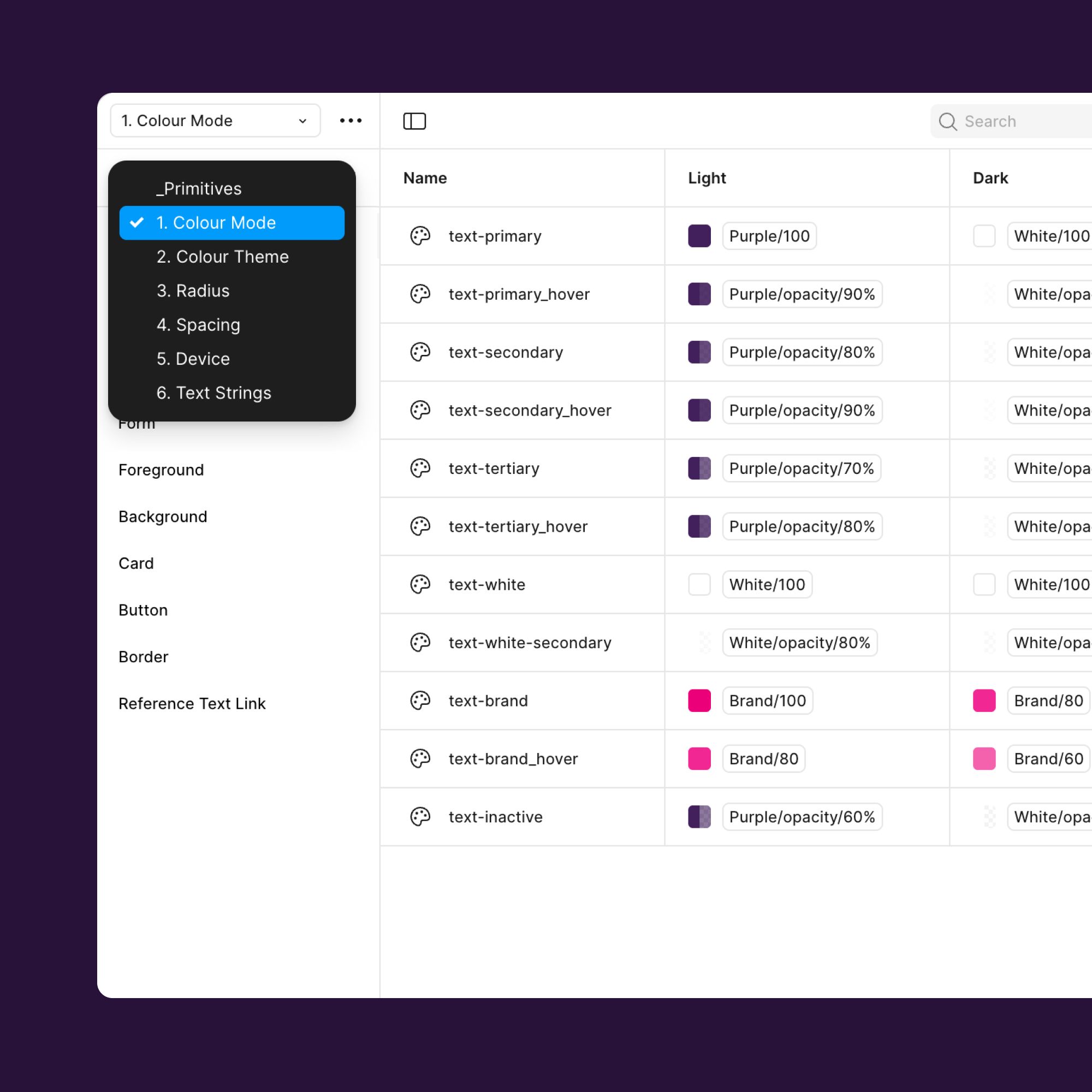
We fix it at the source. We design structured content in Sanity so clarity travels with the user. Fields, variants and rules that reflect real contexts. Short forms for mobile tasks. Rich detail for considered desktop moments. Copy that scales with hierarchy. Interactions that adapt without rework.
Editors get clear controls and real time preview. Components read the same structure in code. Design, content and delivery stay in sync because the model in Sanity matches the intent in the UI.
Content, context, interaction and intent move together. The value of your product is always understood.
Developer handover that works in the real world
As a responsive web design agency, we know responsive design breaks when it only exists in Figma. We take it further. Our designers and front end engineers work side by side from day one, so every component, breakpoint and rule is created with implementation in mind.
Design tokens map cleanly to code. Responsive behaviour is documented, not guessed. Sanity content structure matches the final UI, so nothing gets lost in translation when the build starts. Developers get clarity. Editors get control. Customers get a product that simply works.
We do not design anything that only works on paper. We design for production.
Responsive web design systems structured for growth
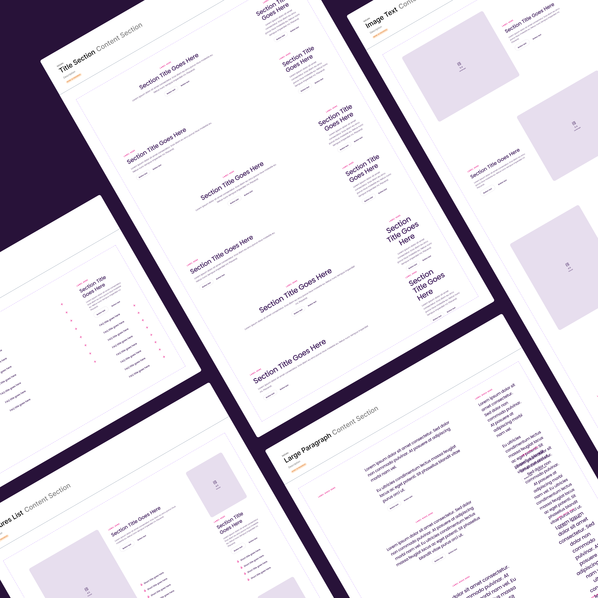
Consistency is easy on the first page. Harder on the fiftieth. Impossible if the system behind it is static. We create Figma design systems that scale responsively from the start. Tokens handle spacing, type, interaction and motion across breakpoints. Components carry the rules so the brand stays intact wherever it appears.
As a responsive web design company, our engineers help define the system from the start, so the same tokens and patterns are implemented cleanly in code. Marketing moves faster. Product ships without redesigning. Every new screen adds value instead of adding inconsistency.
Responsive is not a layout choice. It is a system choice.
Stop watching competitors win
Upgrade the experience. Accelerate the roadmap.
Services
Responsive Web Experience Design Services
- 01
Responsive website design and conversion-focused UI
We design websites that protect clarity and persuasion wherever users browse. Content priority is defined per breakpoint. Navigation adapts based on task complexity. Motion reinforces confidence instead of slowing pages down. Visitors understand the value quickly and keep moving through the journey on any screen.
- 02
Figma design systems for responsive scale
Quality drops when websites expand faster than the design can support. We fix that with a responsive design system built in Figma, with tokens that control spacing, typography, motion and interaction rules across every breakpoint. Marketing and engineering move faster together. Every new page stays consistent and on brand.
- 03
Responsive content architecture built in Sanity
Layout changes are the easy part. We engineer the content foundation so hierarchy and messaging stay coherent as devices change. Sanity-powered structured content ensures headings, CTAs and storytelling adapt without duplication or redesign. Editors get freedom. SEO performance stays strong everywhere.
- 04
Mobile-first usability and accessibility that reduces friction
Touch targets that respect thumbs. CTAs that stay visible when intent is highest. Typography that remains readable without zooming. Accessibility standards implemented from day one. We remove pointless effort so users reach the goal faster and trust your brand more.
- 05
Performance-led design to boost speed and rankings
Core Web Vitals are influenced by design decisions long before code is written. We optimise layouts for faster perceived load, stable rendering and minimal visual shift. Better UX metrics, better SEO rankings, better conversion - design that directly supports growth.
- 06
Headless ecommerce web design that converts across devices
Browsing and buying behaviours differ dramatically between mobile and desktop. We design product storytelling, discovery and checkout journeys that account for that shift. Confidence on small screens. No drop-off when intent rises. B2B or D2C, headless or Shopify - conversion travels with the user.
- 07
Search-optimised responsive page structures
We combine UX and SEO from the start. Structured hierarchy, scannable copy and reusable content formats designed to maintain search strength regardless of viewport. No trade-off between aesthetics and discoverability.
- 07
Engineer-aligned delivery that ships without surprises
We work with frontend constraints in mind. Breakpoint logic is documented clearly. Interactions are tested visually and technically. Our developers collaborate directly with yours so the design system and CMS implementation deliver exactly what was intended - in real code, not just static screens.
Case Study
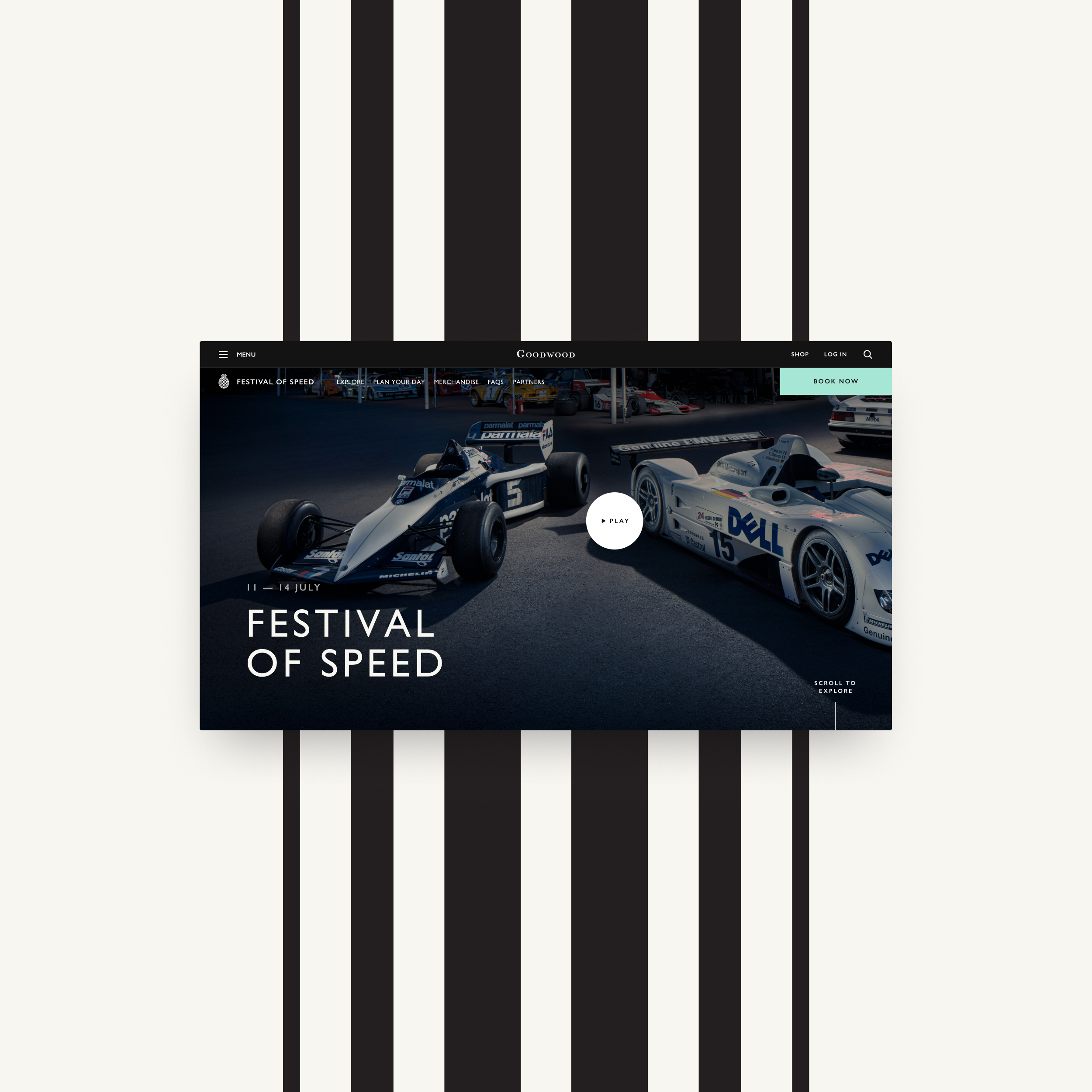
A responsive experience designed for every Goodwood audience
Goodwood
Design sprintGoodwood’s digital presence has to serve many missions at once - motorsport fans browsing on the move, hospitality buyers planning high-value visits, and members accessing exclusive content. We redesigned Goodwood.com so the experience adapts to intent, not just screen size. Content is structured for speed and clarity. Navigation shifts based on confidence. Interactions support discovery on mobile and deeper engagement on desktop. The result is one digital ecosystem designed to move with every user, wherever they are in the journey.
Read the case study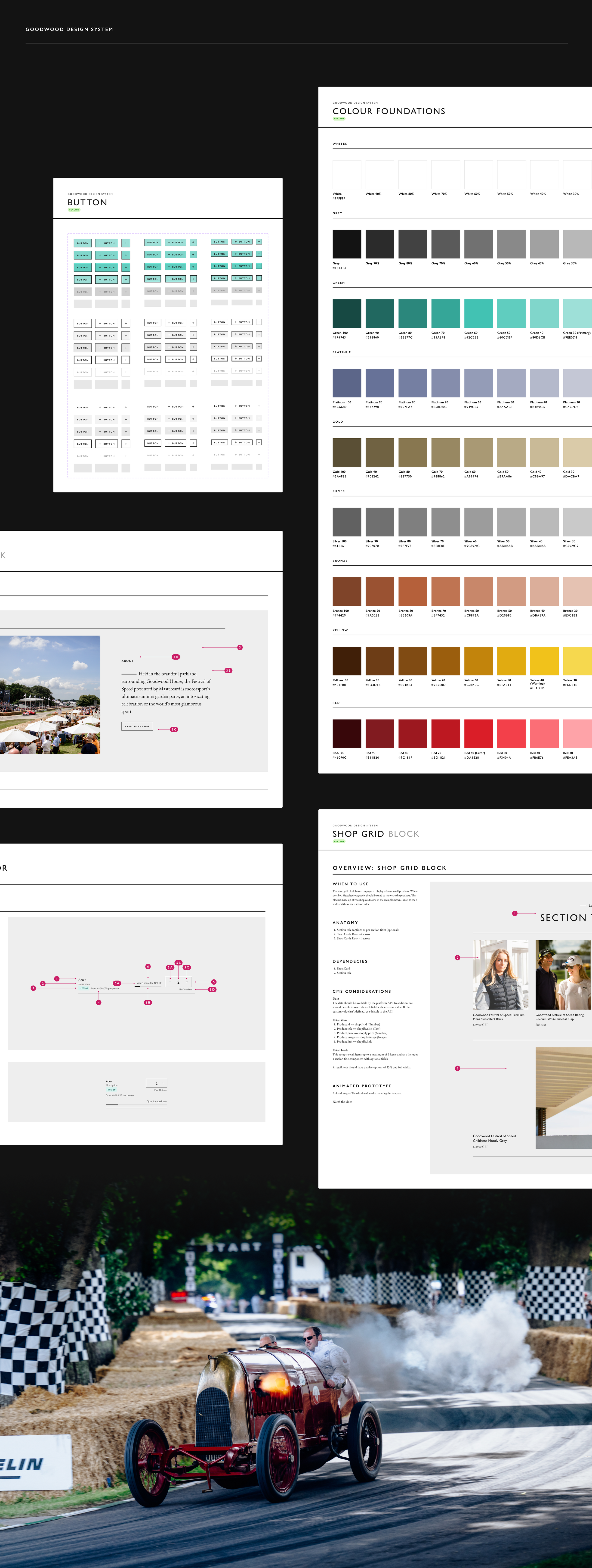
Responsive Web Design FAQs
01What makes responsive web design more than just breakpoints?
Most agencies rearrange components and call it responsive. We design for behaviour at each breakpoint. Attention spans and interaction patterns shift with context so content hierarchy, navigation and conversion cues adapt too. The result is clarity and momentum that travel with the user instead of being tied to a single layout.
02Do you design mobile first?
Not strictly. We design context first. Some journeys begin on desktop and finish on mobile. Others are the reverse. We map intent across devices and optimise where real decisions happen. Device specific priorities lead to higher conversion and happier users.
03How do you ensure what is designed is what gets built?
Our designers and front end engineers work together using shared systems such as design tokens, Storybook and responsive documentation. Behaviour is defined before handover so developers are never guessing. If it is not buildable or performant it does not go into the design.
04Can design improve Core Web Vitals and performance?
Yes. UX decisions influence stability, network strain and perceived speed. We prioritise content, reduce layout shift and use motion only when it helps users progress. Engineering builds fast and design ensures it stays fast.
05How does structured content improve responsive design?
Layouts change often. Messaging should not break when they do. We design structured content inside Sanity so headlines, CTAs and product information adapt automatically across devices and journeys without duplication. Editors get flexibility and consistency stays strong. Remember the old “responsive vs adaptive” debate. One relied on breakpoints, the other needed multiple versions of the same content. Headless CMS platforms like Sanity and frameworks like Next.js quietly deliver both at once. The frontend responds to screen size and behaviour. Content adapts to audience and intent.
06Do you support responsive ecommerce experiences?
Yes. Buying behaviour changes by device. People might browse on mobile and complete purchases on desktop when decisions feel bigger. We design ecommerce journeys that adapt to that mindset. Product discovery stays effortless. Basket value stays protected. Checkout removes friction rather than adding more steps.
07How do you measure success?
We track meaningful outcomes. Task completion. Engagement with key journeys. Reduction in friction and bounce points. Conversion uplift where it matters. Analytics and optimisation are built into the process from the start rather than added later.
08Will responsive changes affect SEO?
Positively. Search engines reward performance, accessibility and mobile experience. Faster load, improved usability and better content hierarchy all support stronger rankings and increased conversions from organic traffic.
Stop watching competitors win
Upgrade the experience. Accelerate the roadmap.