Firstly, what is a Design System?
It’s a comprehensive, living resource of standards, reusable UI component library, and technical documentation that defines your digital product's aesthetic and behaviour, featuring these key elements:
Components
Reusable UI elements such as buttons, cards and navigation bars built and documented for both designers in tools like Figma and developers in code libraries. We use Storybook as the hub for this. It allows components to be built, viewed and tested in isolation. Each component is referenced directly against its Figma design, following an atomic structure of components, templates and pages to keep design and code tightly aligned.
Design tokens
The foundational, atomic variables that store visual properties like colour codes, spacing units and typography scales. They are the single source of truth for design properties used across both design and development.
Documentation
Clear guidelines on usage, implementation and editorial standards. Storybook becomes the reference point where design, code and documentation live side by side.
Accessibility standards
Rules for component design and code to make sure usability and accessibility are baked in from the start. Accessibility testing, visual regression testing and component validation all happen directly within Storybook.
The benefits are transformative. Increased scalability, consistency, faster development cycles and efficiency gains by reducing design interpretation and reinvention across teams and platforms.
For a deeper dive into Design Systems explore the world of Atomic Design with Brad Frost.
A Headless CMS is designed to deliver content consistently across all channels, while a Design System ensures every element created adheres to the same visual standards.
The challenge lies in their integration: the headless architecture deliberately decouples content from presentation, making it difficult for the Design System to enforce consistency across multiple, disconnected frontends.
Effectively integrating these two modern systems is the only way to unlock first-class user experience at every single brand touchpoint online.
Design challenges in headless environments
Headless architecture is powerful because it allows authors to focus purely on content, leaving the technical presentation layer to the frontend applications.
The challenge arises from the lack of centralised styling. When the same content API feeds multiple frontends, unless the design properties are strictly managed, each different framework (e.g. React, Vue, native mobile) could produce multiple visual inconsistencies.
Let’s take an example of a call to action button. Imagine you’re writing a blog and want to use a CTA button in your CMS. That same CTA button may have different styling when applied in an app, because it responds to different design cues, or applies a different theme and therefore looks inconsistent or misaligned. We need to overcome this challenge by establishing the meaning - or intent - of components and sharing these across the different platforms. The intent is placed on hierarchy, or purpose of that component, not a visual directive: it’s no longer ‘red button’ or ‘blue button’. It’s a ‘[primary/secondary/tertiary] button’ which will obey the style guidelines of wherever it appears.
Buttons looking slightly inconsistent across platforms may not sound like a huge problem, but inconsistencies like this can degrade perceived quality of your business, and even trust in brand. While difficult to quantify, once user trust is eroded, it’s really hard to win back.
We’re not designing pages, we’re designing systems of components.
Integrating Design Systems with headless CMS
1. Design Tokens are the unifying layer
The most fundamental step is keeping the Design Tokens (e.g. colours, spacing, typography) synchronised across multiple frontends when they are decoupled from the content system.
- Centralise the source: Design Tokens are typically managed in a source file (e.g., JSON or YAML), but your headless CMS won’t automatically know about them. Developers must ensure that every independent frontend (aka the head) consumes the exact same tokens, converted into their specific framework's format (CSS variables, native Swift, etc).
- Robust automation: make use of tools like Style Dictionary, TailWind, NativeWind and automated build pipelines (via GitHub Actions) to automatically convert and distribute these token values from a single source file into every format needed (CSS variables, JavaScript variables, native mobile code). This process ensures genuine cross-platform parity.
- Version control: your Design Tokens should be treated as a versioned product. This means you can track and manage changes, allowing your team to push a new version (e.g. v2.0) of the design system across all consuming applications simultaneously, making rollouts efficient and predictable.
2. Synchronising Component Libraries
Code components (in the Design System’s library) and the content fields (in the headless model) should always be in sync. This ensures the functional code matches the visual design:
- Storybook: this is essential for visually documenting and testing your UI components in isolation. It serves as the definitive reference point, making sure that developers across all ‘heads’ build components that match the approved specification.
- Figma integration: designers should work within tools like Figma, directly referencing the same core Design Tokens and components mirrored in the code. This tight integration prevents the drift between design mock-ups and the live digital product.
- Cross-function collaboration: shared ownership is the key to success here. It demands a tight, continuous feedback loop where designers, developers, and content strategists collaborate to define and maintain the rules, and are accountable for the outputs and outcomes.

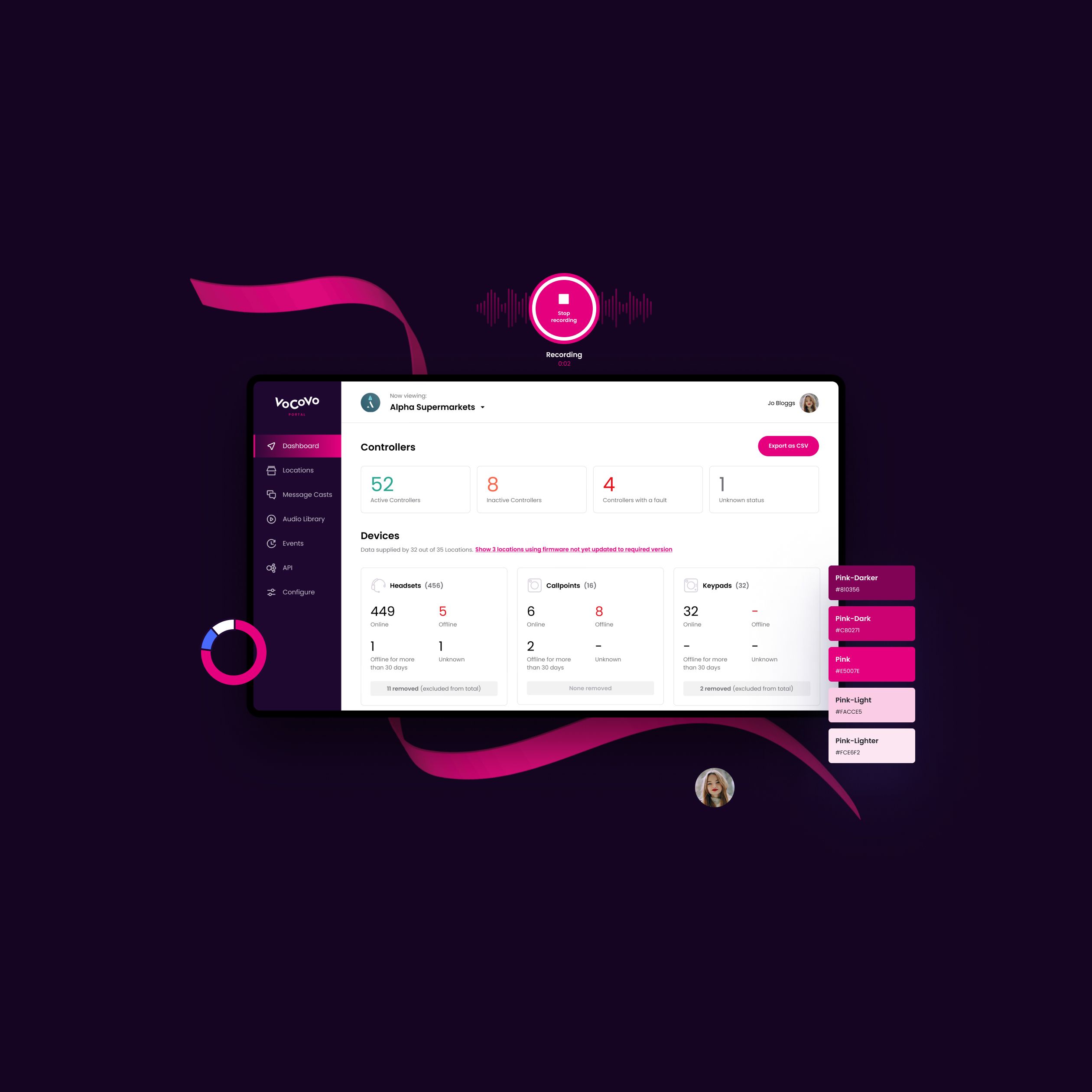
VoCoVo
Design System CreationThe Consistency Advantage
In the headless age, your authority hinges on consistency. A robust Design System is the engine that ensures every one of your distributed experiences is perfectly aligned, accessible, and high-performing. It allows your brand to deliver high-quality digital products quickly and at enterprise scale.
